ESRI StoryMap about Sustainable Agriculture in William & Mary’s dining halls.
Author: Hannah Dempsey
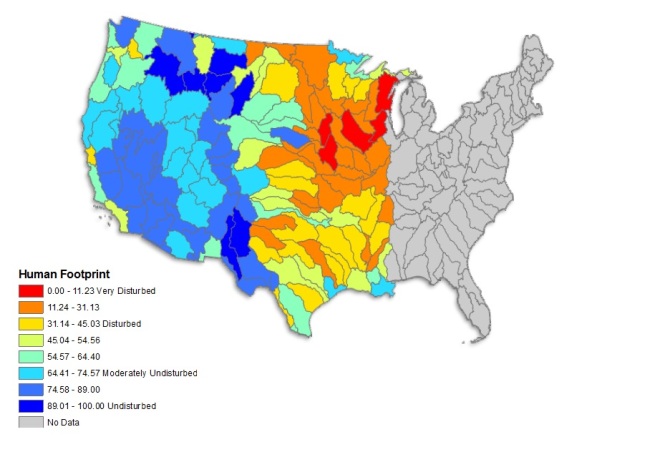
Measuring the Human Footprint in Protected Areas
This past fall I was lucky enough to take Dr. Dan Runfola’s Data Driven Decision-making course. I learned more than I ever wanted to know about Monte Carlo simulations in excel, measuring and including uncertainty in our analyses, and how to work with policymakers. By the end of the semester we were paired up with organizations that fell within our wheelhouse: one group examined judicial efficacy in Liberia, another worked with Save the Children, and I was set up with Dr. Healy Hamilton from NatureServe.
Healy’s team has done some truly impressive work with conservation data in the US, and it was my task to look at vulnerable protected areas. Using Healy’s human footprint data (over 20 indicators compiled into 3 main categories of infrastructure, transportation, and land use) I selected the top 10 HUCs that contain US protected areas that are vulnerable to human disturbance. In addition, while NatureServe’s data is incredibly robust, it is currently under review for publication–why the analysis below is restricted to the Western half of the US–and it’s unclear to me who will have access to this kind of data. This begged the question: what could serve as a relatively simple proxy for this robust human footprint dataset?
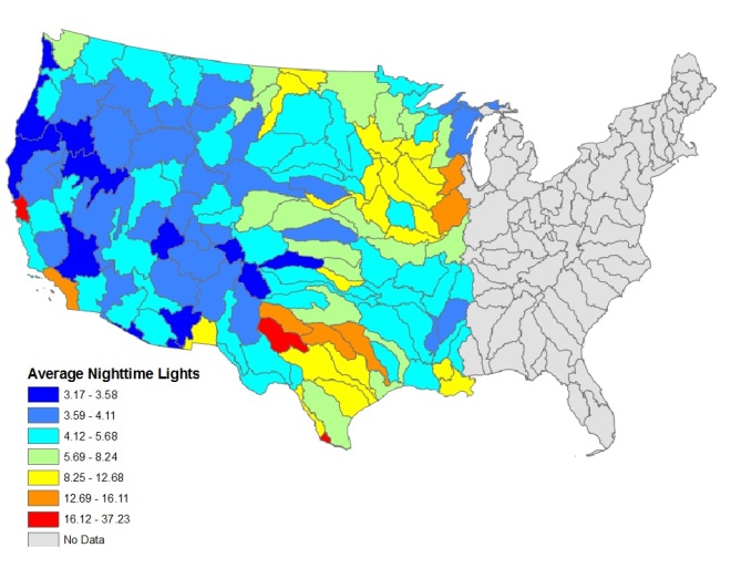
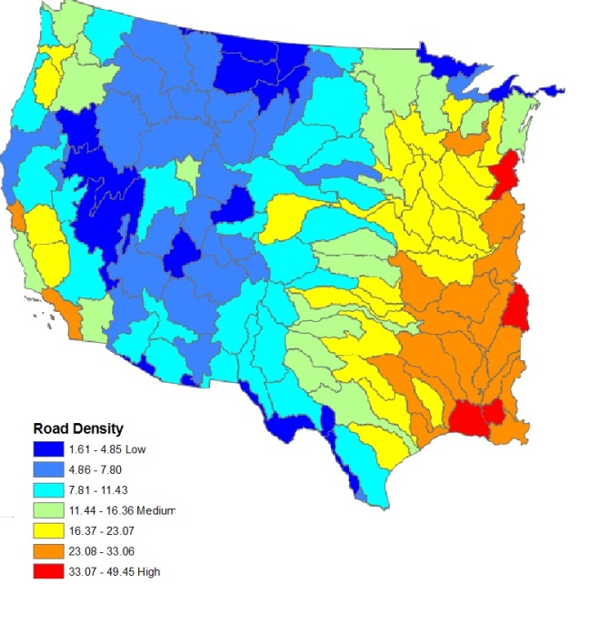
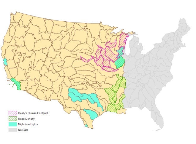
Unsurprisingly, there was no strong overlap between the proxies and Healy’s data–something I attribute to the inclusion of the variable land cover in Healy’s dataset–and I wouldn’t argue that nighttime lights or road density are appropriate proxies. However, they do have some value. Using these indicators offer more specific instructions to policymakers: the HUCs that have protected areas suffering with high nighttime lights could likely use a public awareness campaign that reduces light pollution (aside: did you know that light pollution is a major contributor to bird death?). Similarly for road density, protected areas in these HUCs could maybe use habitat corridors over/around nearby roads. I’m just spitballing here.
I would say that the NatureServe data would be incredibly powerful to hand over to policymakers when they ask where the most vulnerable protected areas are located, whereas the proxies might be better for making specific policy recommendations.
Find the full brief plus the analysis step-by-step, here: Final_Brief
Exploring Ghana for Development Gateway
Development Gateway sent a team to the Ghanaian government and requested appropriate maps from AidData that illustrated the advantages of collecting and maintaining spatial datasets. I designed several maps that ranged from a simple chloropleth map to a raster of cropland to a slightly more analytical map that asks how World Bank projects are allocated according to large cities. The power of spatial data is real #endpreach.
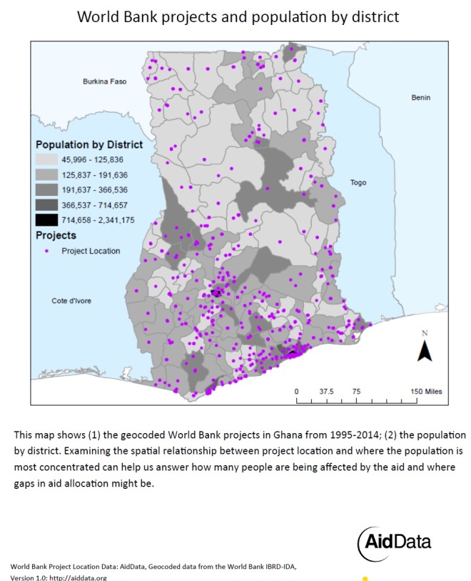
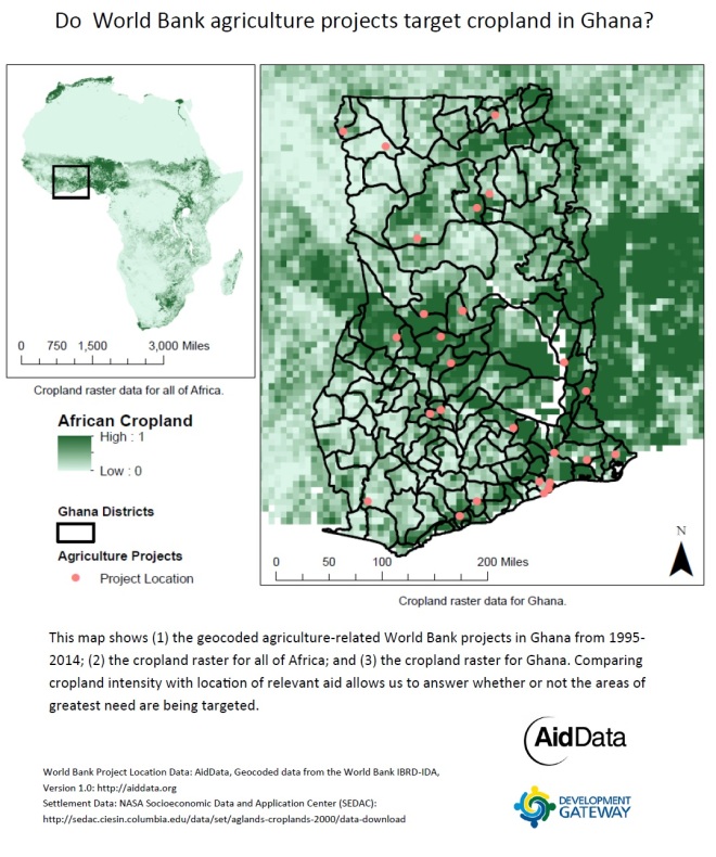
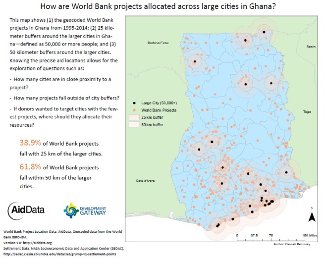
While these maps aren’t perfect, I think they fulfill the role they were designed for: showing how robust spatial data can answer allocation questions… and how it can spark correlation vs. causation debates.
Introduction to GIS: Final Project Poster
The final poster from a semester-long GIS course that examines the spatial relationship between elderly homeowners and clinics that accept medicare in Loudoun County, VA: Examining the Accessibility of Healthcare for the Elderly in Loudoun County, VA: The spatial relationship between elderly households, doctors’ offices, and Medicare providers in 2010.

And the readable version:


