I was tasked to create a simple map showing the 2016 minimum wage by state.
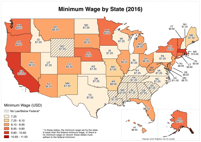
I was tasked to create a simple map showing the 2016 minimum wage by state.
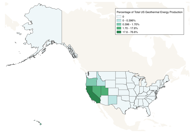
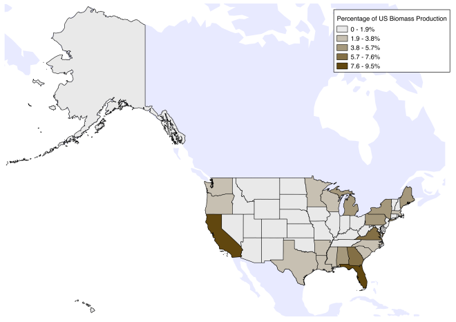
For National Energy Awareness Month, I created an educational map spotlight for the National Geographic Education Website.
All maps and associated materials were created or compiled by myself, and edited by NatGeo’s resident human encyclopedia: Caryl-Sue Micalizio.
I wrote a series of alternative energies blogposts for National Geographic’s Education Blog for National Energy Awareness Month: tidal power, biopower, and geothermal power.
I wrote a blog post (carefully edited by the communications team) for AidData’s blog, The First Tranche. This is the culmination of a summer of research with USAID/Nepal in Kathmandu.
Quantifying remoteness across Nepal.
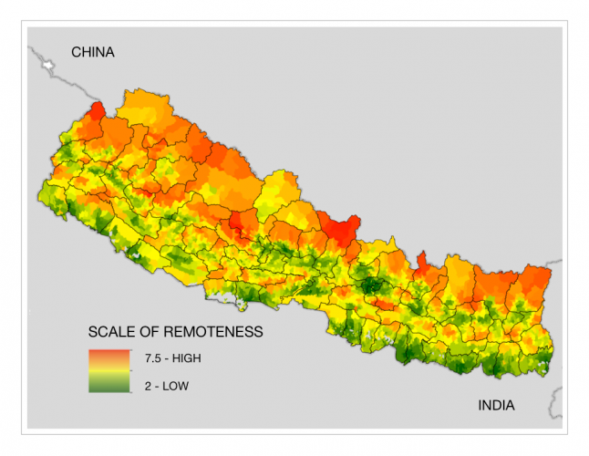
Designed 75 district basemaps to be uploaded to USAID/Nepal’s interactive arcGIS online page (for context. Layers can be toggled on/off). Included a massive amount of data aggregation and cleaning in order for the shapefiles to fit together appropriately.

A non-academic blogpost about my early experiences in Nepal as a 2016 AidData Fellow.
Designed a simple map to serve as a illustration in USAID/Nepal’s chief economist’s presentation to implementing partners. Agriculture is the main source of employment for the Nepali people, and the spread of a crop pest is of concern not only for farmers but has widespread economic implications as well. VDCs are small municipalities within the labelled districts.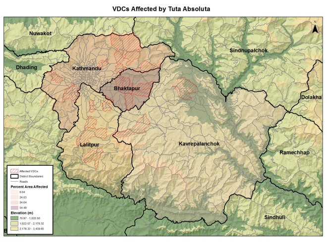
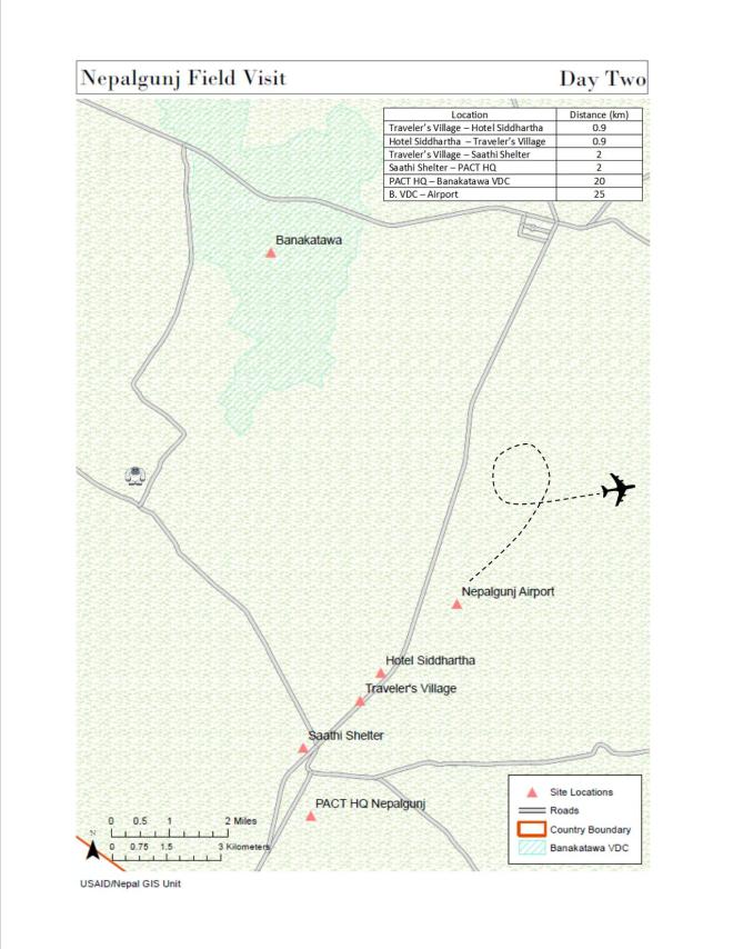
Tasked to make a simple cartographic representation of the USAID/Nepal Mission Director’s two day trip to Nepalgunj, a small municipality in the Mid-Western region bordering India, to give context to the day-to-day activities.

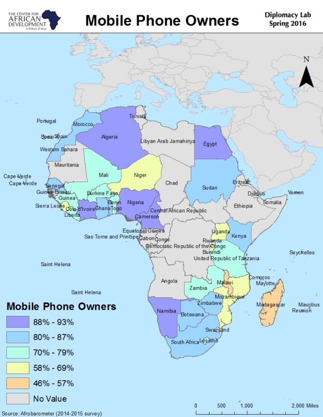
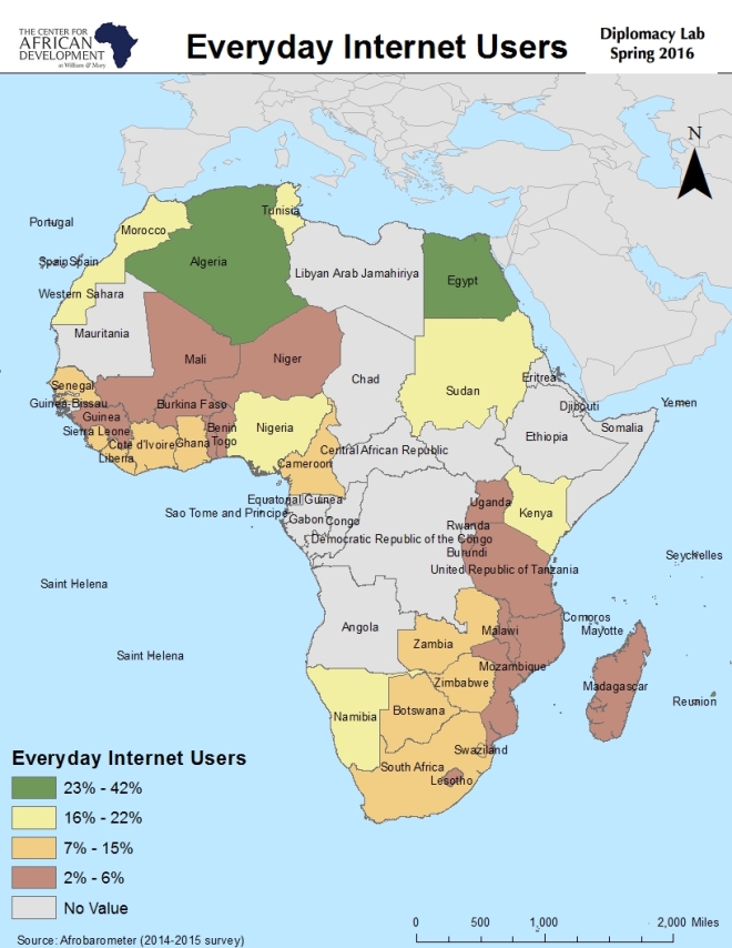
I was tasked by CAD to make visuals for their presentation to USAID, based on Afrobarometer surveys and We Are Social data.

Original research conducted for and presented to the USAID GeoCenter, blog post drafted for AidData’s blog, The First Tranche.
An unassuming fish has the potential to be the greatest threat to political stability in Armenia. Is that fairly click-baity? Maybe. But in all seriousness, fishes like sturgeon and trout are exported from Armenia to Russia for a large profit, and fishery proliferation has lowered the water table and access to energy in the Ararat Valley.
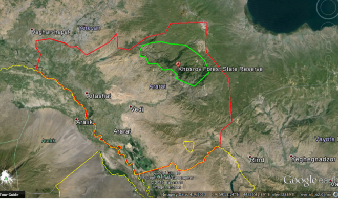
Google Earth imagery of Armenia (outlined in red).
Armenia is a landlocked country and the majority of its sturgeon are farmed in hundreds of fisheries across the Ararat Valley. They range from small pools for subsistence-style farming to acres of water owned by the political elite. The fisheries are profitable—hence the explosion of farms in the past decade—and pay for valuable energy for the Armenians. They use one particularly valuable resource: cold, fresh, clean water.
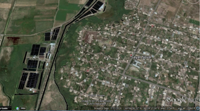
Google Earth imagery of fisheries adjacent to the town Sayat Nova
The Ararat Valley sits on top of a high water table. Water was so readily available that it was free, and didn’t need to be pumped out of the ground; however, likely due to the proliferation of fish farms the flow rates from the wells have decreased.
This is potentially problematic for two reasons. First, with the growth of a younger and more politically active generation the average young Armenian is more likely to be vocal about paying for previously free water—especially when excessive water consumption comes from commercial fisheries. This becomes more complicated when keeping in mind the Armenian dependency on Russia for oil and gas, which fish farming pays for. Second, a vital nuclear power plant sits near the valley which requires water to keep it cool and prevent a meltdown—and as the water table drops this situation could become much more dire.
Because of this, the U.S. Agency for International Development was interested in measuring the fish farm growth and, more importantly, water usage. The USAID GeoCenter had approximations of fish tank depth but needed the other dimensions in order to measure water use. Using Google Earth I delineated the fisheries and sent them to the GeoCenter’s GIS Developer, Brian Bakker, for further analysis. With ArcGIS a water mask can be applied to calculate the surface area, and with my polygons the mask was more precise and accurate. In hindsight, I would have used the open-source online mapping platform, OpenStreetMap, to make my edits available to everyone.

Google Earth imagery of the largest fisheries in the Southern tip of Armenia
The steps were simple, but the first questions were: can we even see these fisheries via satellite? Can we tell when they first appeared? The answers were: yes, and sometimes, respectively. Simply hovering over the Ararat Valley revealed the largest fisheries, and zooming in to a town showed even more. Google Earth has a basic “create polygon” tool that allowed me to point, click, and capture each fishery.
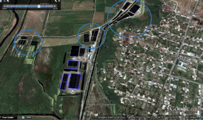
Google Earth imagery of drawn polygons around the fisheries
Unfortunately, while Google Earth has historical imagery Armenia is not well covered and there are large gaps in imagery year. The year of establishment could not be determined for most of the fisheries using Google Earth, although a range could be estimated for some.
I mapped over 200 separate fisheries, varying in size from just a few square meters to entire acres. Using this information, the GeoCenter can assess the water use in the area and determine whether or not the farming of sturgeon could be affecting the recent drop in water availability, and the future of fisheries and access to energy in the valley.

Google Earth imagery of the majority of mapped fisheries
Hannah Dempsey is the data visualization team lead at AidData and a Senior at The College of William & Mary.
